Aruba is the 1st beauty app in Paraguay where you can book at-home beauty services appointments from your cellphone.
As a start-up company, they wanted to create a successful business where people could schedule appointments for beauty services through their app.
The app's first launch was an exciting moment for the start-up company; however, most users preferred to use WhatsApp to book at-home services instead of using the app because it needed to be more intuitive and clear.
That's when they hired me for the UX/UI Designer role to identify the current pain points and simplify the flow of scheduling an appointment to improve user experience.
The app's first version was not intuitive and hard to use, and users preferred to schedule appointments through other platforms.
As part of a redesign process, we first evaluate the current experience of users using the app to identify significant areas for improvement.
We also analyzed the main flows and created a journey map to spot those areas of opportunity to simplify the steps.
Also, many sketches were created on paper to later translate those ideas into a design tool and finally make a clickable prototype on Invision to see and understand the functionality and flows.
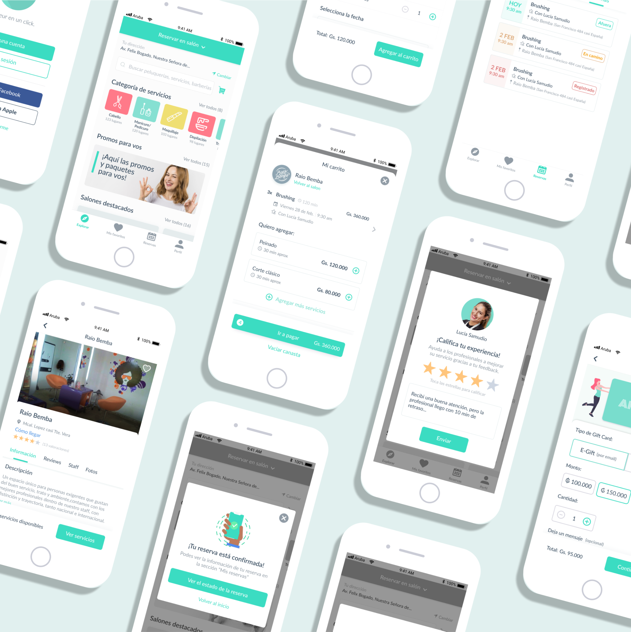
There were seven main sections that we worked on:
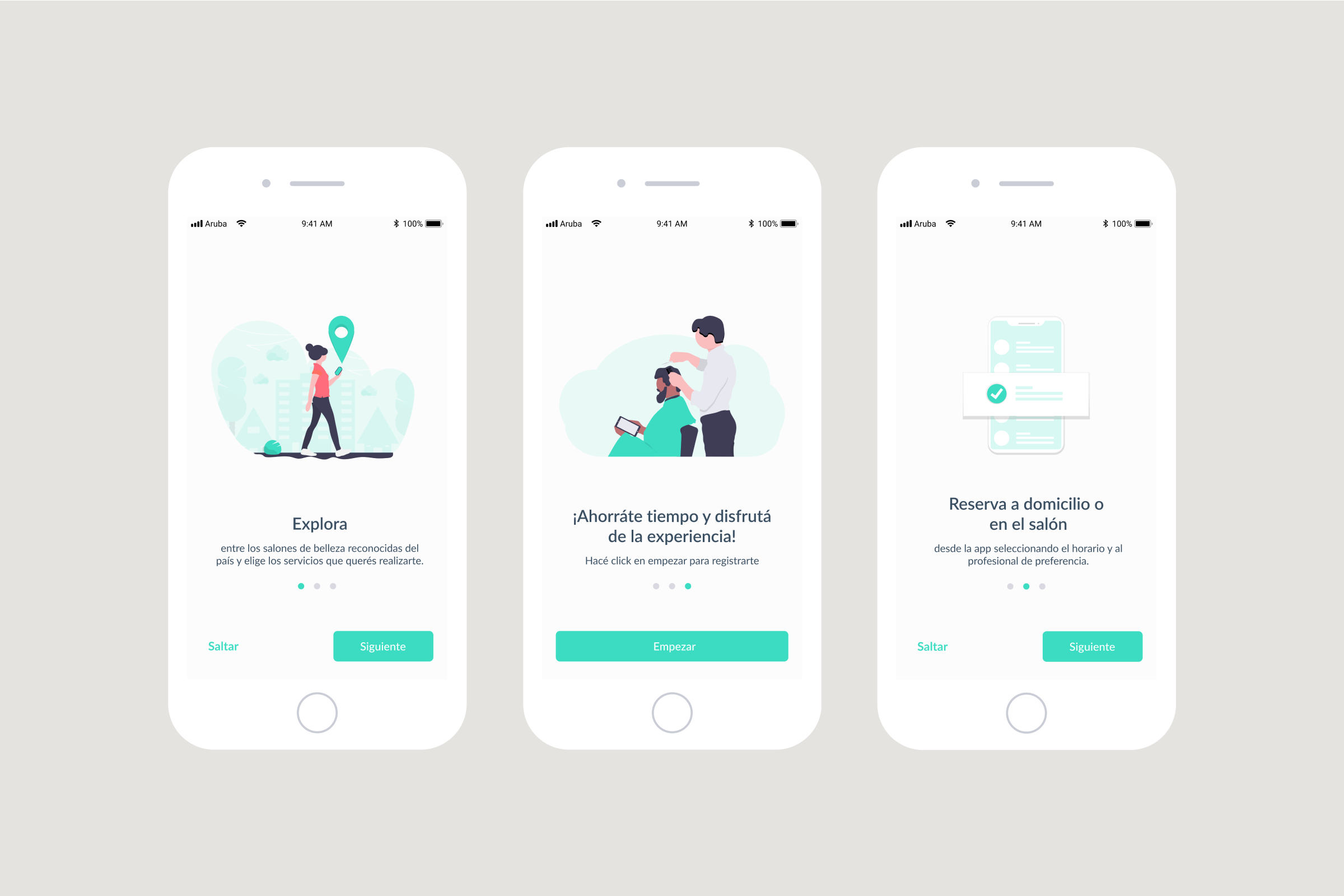
- Onboarding: Incorporated the flow of experience of first-time users.
- Login/Signup: Improved design and prototype of the registration and login flow.
- Home Page: Improved design for the home section, which is the starting point for users to take action.
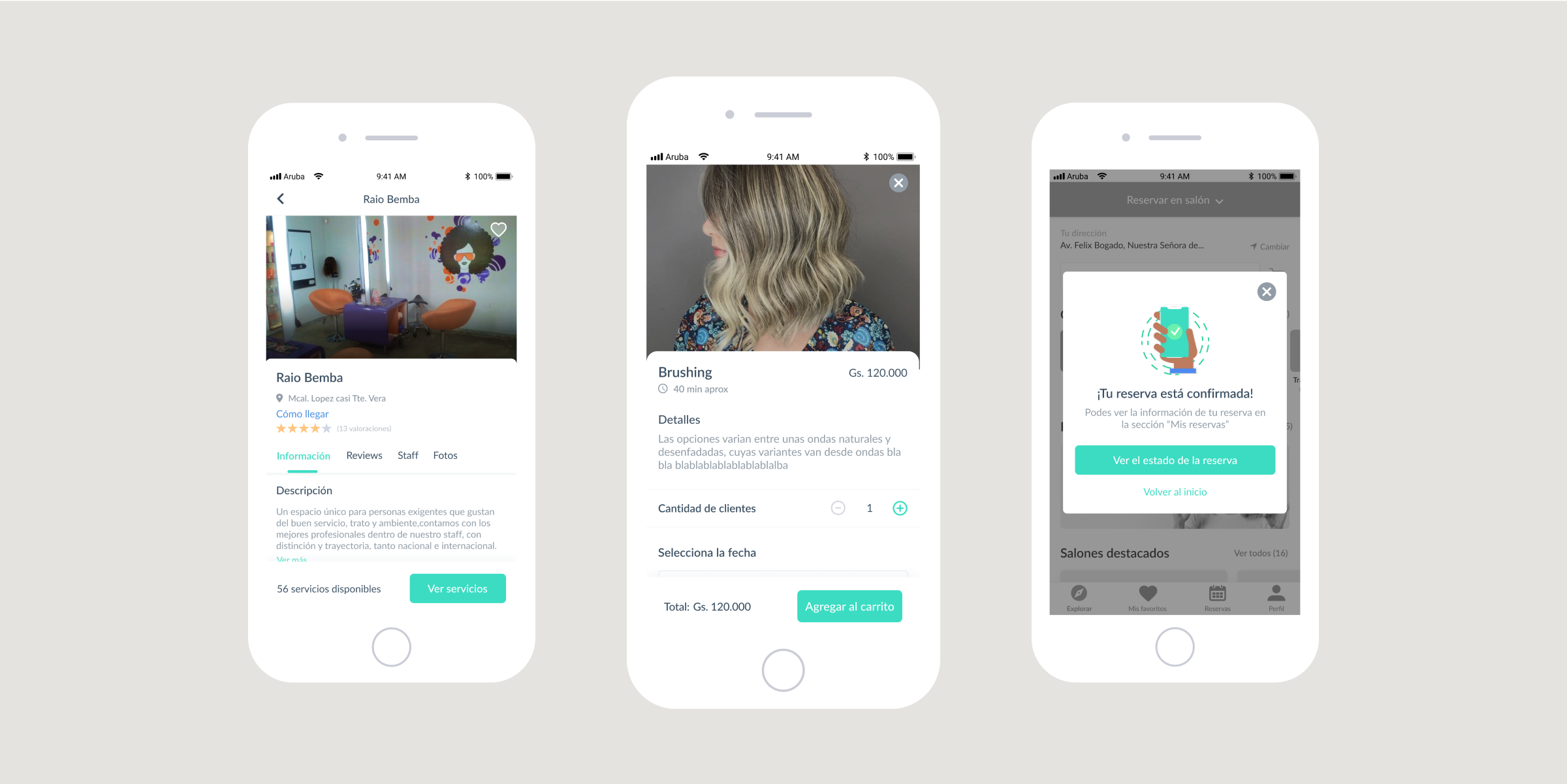
- Services Page: Improved design where users pick the services they want with different options.
- Payment flow: Improved design and flow to make payments with multiple options.
- Appointments & Favorites Page: Improved design to view scheduled appointments and favorite services and professionals.
- Gift Card and Subscription Screens: Incorporated a new feature to purchase a gift card and to subscribe to monthly services according to user preference.
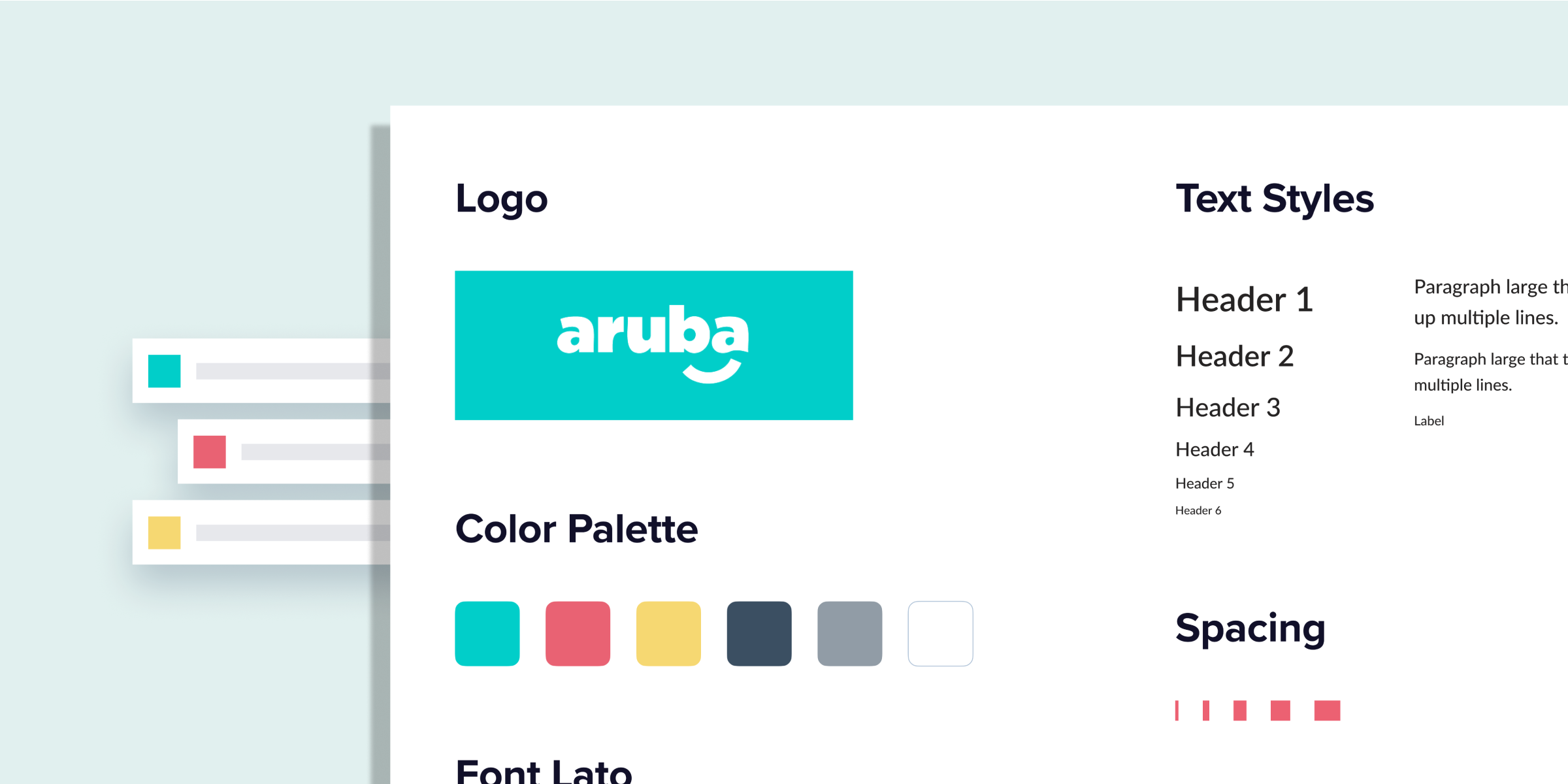
Across these sections, we also worked on the visual design based on Aruba's branding.
One significant constraint was the tight budget for the redesign process. Even tho research and user testing were included in the proposed budget, the client decided to refrain from carrying on these activities and go straight to the design.
As a UX/UI Designer, this was a significant challenge and frustration since our job is to apply methods that ensure a user-centric design. However, I had no option but to do the work.
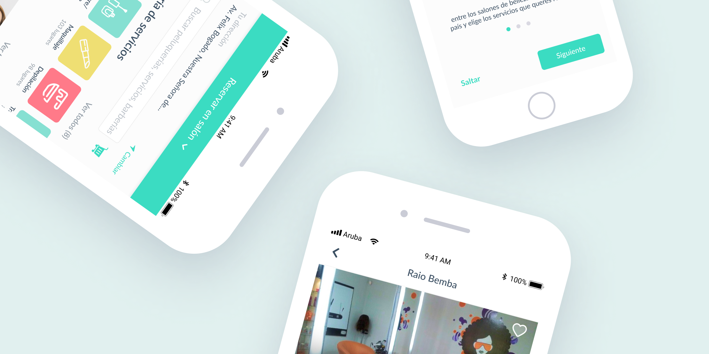
We redesigned the entire mobile app based on the new business model and an enhanced user experience that made the app so much easier to use for users.
We also included new features to make the product more valuable for people.
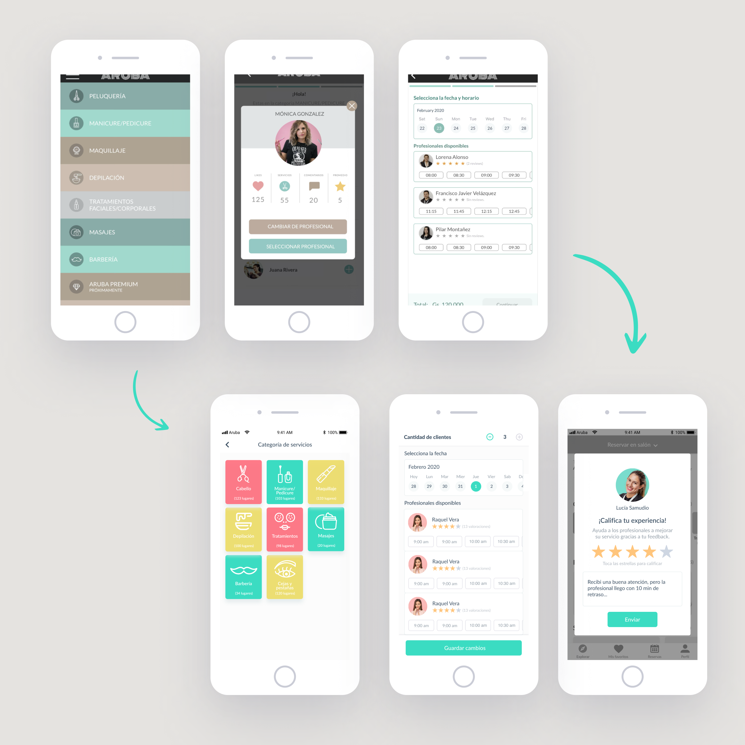
Even though the Aruba App 2.0 was never launched because the company confirmed that the new business module won't work, this experience allowed me to practice all the UX knowledge and principles I have learned for the first time. In addition, this experience also allowed me to understand better how to use design tools.
One of my main lessons is communicating the importance of research and user testing to clients from their point of view to educate them about UX best practices and ensure a user-centric design in all projects I get involved in.